back to impact
reshaping a global sap website around buyer needs
rebuilding a complex enterprise website around stronger discovery, sharper positioning and easier content management.
40%
increase in organic traffic within three months
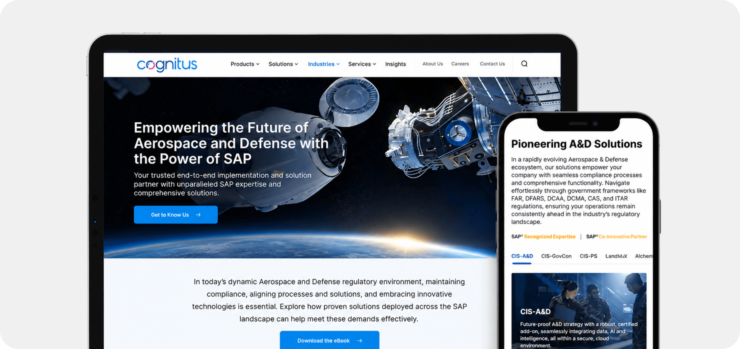
industry
enterprise technology
type
corporate digital platform
mandate
website and brand experience redesign
the business
the client was a global sap solutions provider with a broad portfolio of software, services and enterprise capabilities.
its digital presence had not kept pace with the business. the website carried substantial technical information, but visitors had to work too hard to understand the offer, move between capabilities and identify what was relevant to them.
the site needed to reflect the scale and credibility of the company while making a complex portfolio much easier to explore.

the digital brief
clarient was brought in to redesign the website and refresh the wider brand experience.
the work covered research, information architecture, ux and ui design, content strategy, seo, front-end development and wordpress implementation.
the aim was to create a stronger enterprise presence that could communicate technical depth clearly, perform well across devices and give internal teams greater control over future publishing.
our contributions
UX Research and Persona DevelopmentInformation ArchitectureUX and UI DesignContent Strategy and SEOInteractive PrototypingFront-End DevelopmentWordPress ImplementationQuality Assurance

the clarity problem
the website had to explain a wide sap portfolio without turning every page into a wall of technical information.
services, software capabilities and supporting content needed clearer relationships. search visibility had to improve without letting seo dictate the experience. the new structure also had to work for different audiences while remaining manageable for internal teams.
the challenge was to simplify the path through the business without simplifying the business itself.

the design response
we began by understanding how different users entered the website, what they were looking for, and where the existing structure created friction.
that research informed a new information architecture, clearer page journeys, and a modular system that could grow with the company.
make the portfolio easier to navigate
we reorganized content around clearer paths into services and capabilities.
users could move through the portfolio with less guesswork and reach the right information without having to understand the company’s internal structure first.
make technical depth easier to read
complex sap information was structured around user needs and business relevance.
content hierarchy, page design, and visual systems worked together to make detailed material easier to scan without losing the depth enterprise buyers expected.
give the business more control
a modular design system and wordpress foundation made future updates easier to manage.
reusable components helped maintain consistency while giving internal teams the flexibility to publish new content without rebuilding the experience each time.
make the portfolio easier to navigate
we reorganized content around clearer paths into services and capabilities.
users could move through the portfolio with less guesswork and reach the right information without having to understand the company’s internal structure first.
make technical depth easier to read
complex sap information was structured around user needs and business relevance.
content hierarchy, page design, and visual systems worked together to make detailed material easier to scan without losing the depth enterprise buyers expected.
give the business more control
a modular design system and wordpress foundation made future updates easier to manage.
reusable components helped maintain consistency while giving internal teams the flexibility to publish new content without rebuilding the experience each time.
the impact
larient turned a sprawling corporate website into a clearer and more structured digital platform.
the new information architecture gave visitors more direct routes into the company’s sap capabilities. page structures were designed to balance technical detail with readability, helping users understand what the business offered before moving into deeper product and service information.
content strategy and seo were developed alongside the experience rather than added after design. this helped align search behavior, page intent and enterprise messaging from the start.
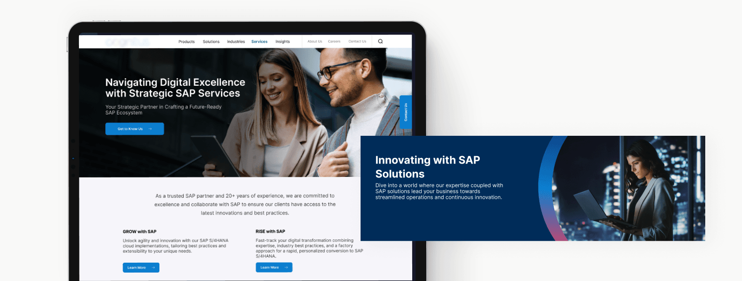
the visual system brought greater consistency across desktop and mobile, while responsive components allowed detailed enterprise content to remain usable across different screen sizes.
behind the experience, wordpress gave internal teams full editorial control within a scalable cms structure. reusable modules made publishing more flexible while reducing the risk of inconsistency as the site expanded.
performance improved alongside the experience. average session duration increased by 60%, while organic traffic grew by 40% within three months.
the website also achieved 90+ lighthouse scores across performance, seo, and accessibility, giving the company a stronger digital foundation for discovery, publishing, and future growth.