back to impact
giving clinical trial recruitment a clearer line of sight
designing a unified experience for screening, enrollment and recruitment performance.
2x
trial enrollment rate within the first quarter
industry
healthcare and life sciences
type
clinical trial recruitment platform
mandate
patient recruitment experience design
the platform
clinical trial recruitment depends on hundreds of decisions made across patients, coordinators, sites and timelines. yet much of that work is still managed through disconnected processes with limited visibility into where potential participants are being lost.
the client envisioned one digital environment for managing recruitment from initial screening through enrollment, while giving teams a clearer view of performance along the way.

the product brief
clarient was brought in to shape that idea into a working product experience across desktop and tablet.
our role spanned research, journey mapping, information architecture, interface design and front-end development. the brief was to make a complex operational process easier to follow while giving stakeholders better visibility into recruitment progress and conversion.
our contributions
User ResearchUX Strategy and UI DesignJourney MappingInformation ArchitectureInteractive PrototypingDashboard DesignFront-end DevelopmentOnboarding Experience


“...helped us imagine a custom interface for a healthcare product in a matter of days. i was impressed with the speed of execution, responsiveness - iterating based on input over the weekend, and the quality of the ux we got - which was ready to share with my executive partners.”

Nate Beyor
Managing Director & Partner, BCG Global Leader - Healthcarethe recruitment gap
recruitment was not suffering from one isolated problem. friction accumulated across screening, eligibility, site coordination and patient engagement, making it difficult to see how the recruitment funnel was performing as a whole.
teams needed to understand where candidates were progressing, where they were dropping out and which stages required intervention. that meant bringing scattered workflows and data into one experience without making the dashboard harder to operate.
the design response
make recruitment visible
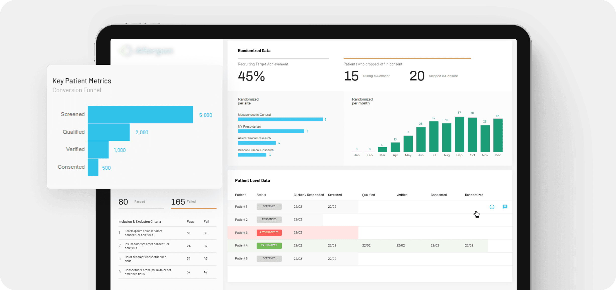
we organized the experience around the movement of patients through screening, eligibility, and enrollment.
clearer funnel views helped teams see progress, identify drop-off, and understand where attention was needed.
reduce the effort of getting started
onboarding was designed to introduce the platform without forcing users through unnecessary instruction.
guided steps and visual cues helped coordinators understand the system quickly and move into the work sooner.
design for decisions, not reporting
data was presented around the questions teams needed answered rather than simply displaying what the system had captured.
this made recruitment performance easier to interpret and gave stakeholders a stronger basis for improving outreach and conversion.
make recruitment visible
we organized the experience around the movement of patients through screening, eligibility, and enrollment.
clearer funnel views helped teams see progress, identify drop-off, and understand where attention was needed.
reduce the effort of getting started
onboarding was designed to introduce the platform without forcing users through unnecessary instruction.
guided steps and visual cues helped coordinators understand the system quickly and move into the work sooner.
design for decisions, not reporting
data was presented around the questions teams needed answered rather than simply displaying what the system had captured.
this made recruitment performance easier to interpret and gave stakeholders a stronger basis for improving outreach and conversion.
the outcome
clarient brought the recruitment journey into one coherent dashboard, giving clinical teams a clearer view from first screening through enrollment.
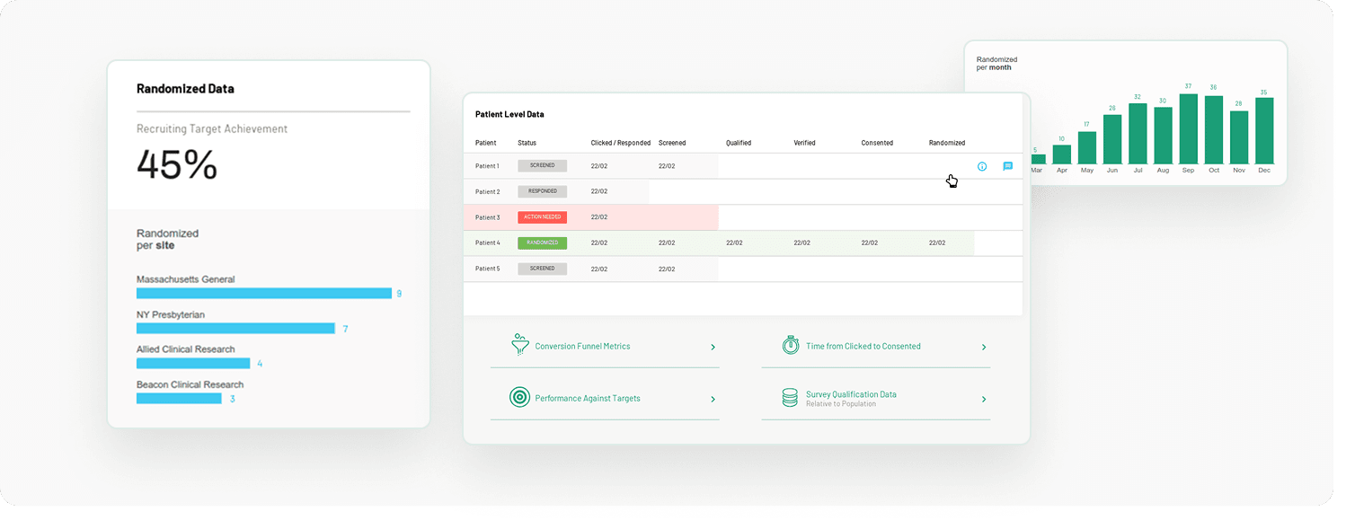
instead of piecing together progress across disconnected processes, coordinators could follow candidates through each stage and see where movement was slowing. recruitment funnels made conversion patterns easier to understand, while the information architecture kept detailed operational data accessible without overwhelming the interface.
the product also introduced a more deliberate onboarding experience, helping new users understand the platform and begin working with less assistance.

a modular interface system gave the product room to evolve. reusable components and consistent interaction patterns meant new workflows could be introduced without fragmenting the experience as the platform grew.
visual data representation played an equally important role. rather than treating analytics as a separate reporting layer, conversion and funnel information became part of the working interface, helping teams connect recruitment activity with performance.
the result was a product that made a difficult process easier to see and easier to manage. patient onboarding time improved by 45%, manual coordination effort fell by 60%, and coordinator satisfaction increased by 30%.
most significantly, the platform recorded a 2x increase in trial enrollment rate within the first quarter, showing what becomes possible when recruitment teams can see the entire journey rather than isolated parts of it.